Tesco’s Enterprise tools and systems are many and varied, helping to keep Britain’s largest food retailer on the right track.
The Partners Toolkit is the portal for Tesco’s suppliers. Here, they can access various tools and systems designed to support everything they need to get their products onto shelves. To better support them, Tesco went on a drive to update all supplier tools.
Performance reporting was the area I was challenged to update. By understanding the supplier's needs and goals, we built dashboards and a new data download tool that increased new user adoption and usage frequency.
I led the UX on the project, with occasional assistance from a junior, and worked closely with the product owner and, in the latter stages, with a UI designer. I reported to a line manager and had to present all findings and work up to board level.
~ 25%
Uplift in unique users (pm)
4.6k
Total users
~ 100k
More unique hits (pm)
Tesco commissioned independent research from the agency Resonant. The key aim was to understand what suppliers use the Partners Toolkit for, how they manage it, and to identify pain points and opportunities to improve the Toolkit. 12 participants were interviewed across a range of product types and job roles. I used this research to build out general personas and to identify where more focused research was required.
One of the key areas for a deep dive was the supplier performance reporting - MicroStrategy and Visual Insights. I conducted 15 on-site interviews with suppliers to observe how they interacted with the tools and used the data in their own environment.
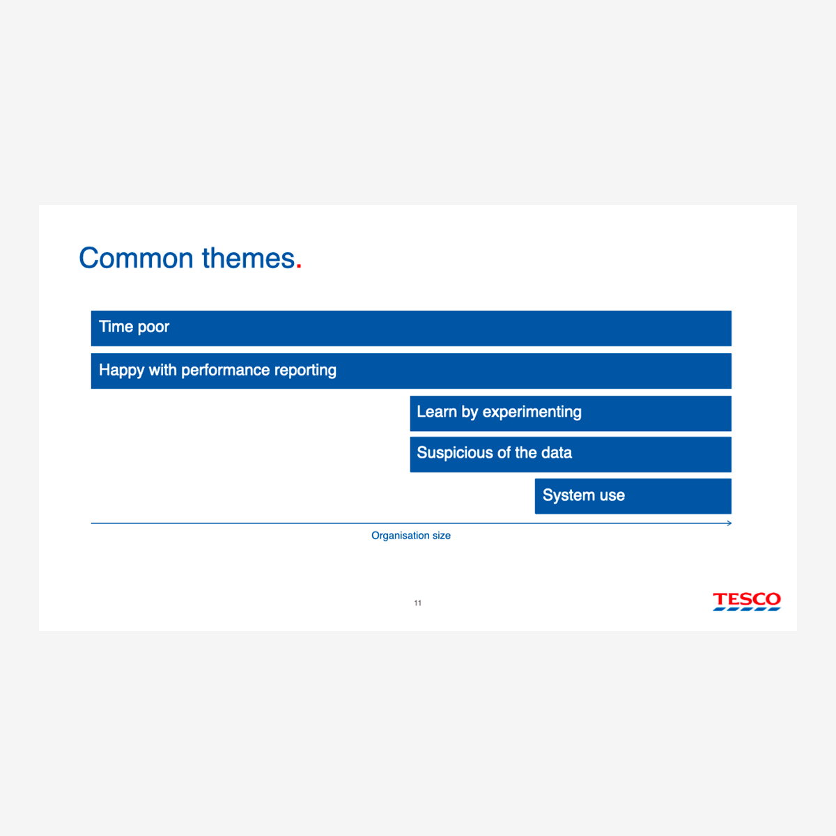
I used a task/activity analysis method to capture what they were doing. This included the activity/trigger, touchpoints, pain points, needs, and emotions during the task. This process yielded numerous insights that directly affected the design of the final product.
The annual online Viewpoint survey invites suppliers to provide feedback on the measures that are most important to them and their businesses. The performance reporting results - the most important data metrics, frequency of data metric use, receiving and consumption of the data - helped steer the above research and gave top-level insights to dive into.
As the research was task analysis based, it was easy to synthesise. At Tesco, findings are reported back to the multiple stakeholders of each project via multiple presentations. This document enabled me to sift through the research and identify the insights needed to advance performance reporting. We knew what data they were looking at, what they thought about it and what they really wanted from it.
Jason (from Resonant) and I created personas based on the broader generative research. This was a difficult task due to the sheer variety of job roles among the suppliers Tesco deals with. We ended up with multiple role-based personas that focused on the specific goals, workflows, and pain points of the archetypes found within the supplier organisations.
Together with the product owner, we set a vision for the supplier performance product:
“A single destination that provides access to the performance information our diverse suppliers need to work more effectively with Tesco and provide a better service to shoppers.”
From the research and personas, I established key criteria and high-level requirements to help generate concepts and cross-check designs against user needs and pain points:

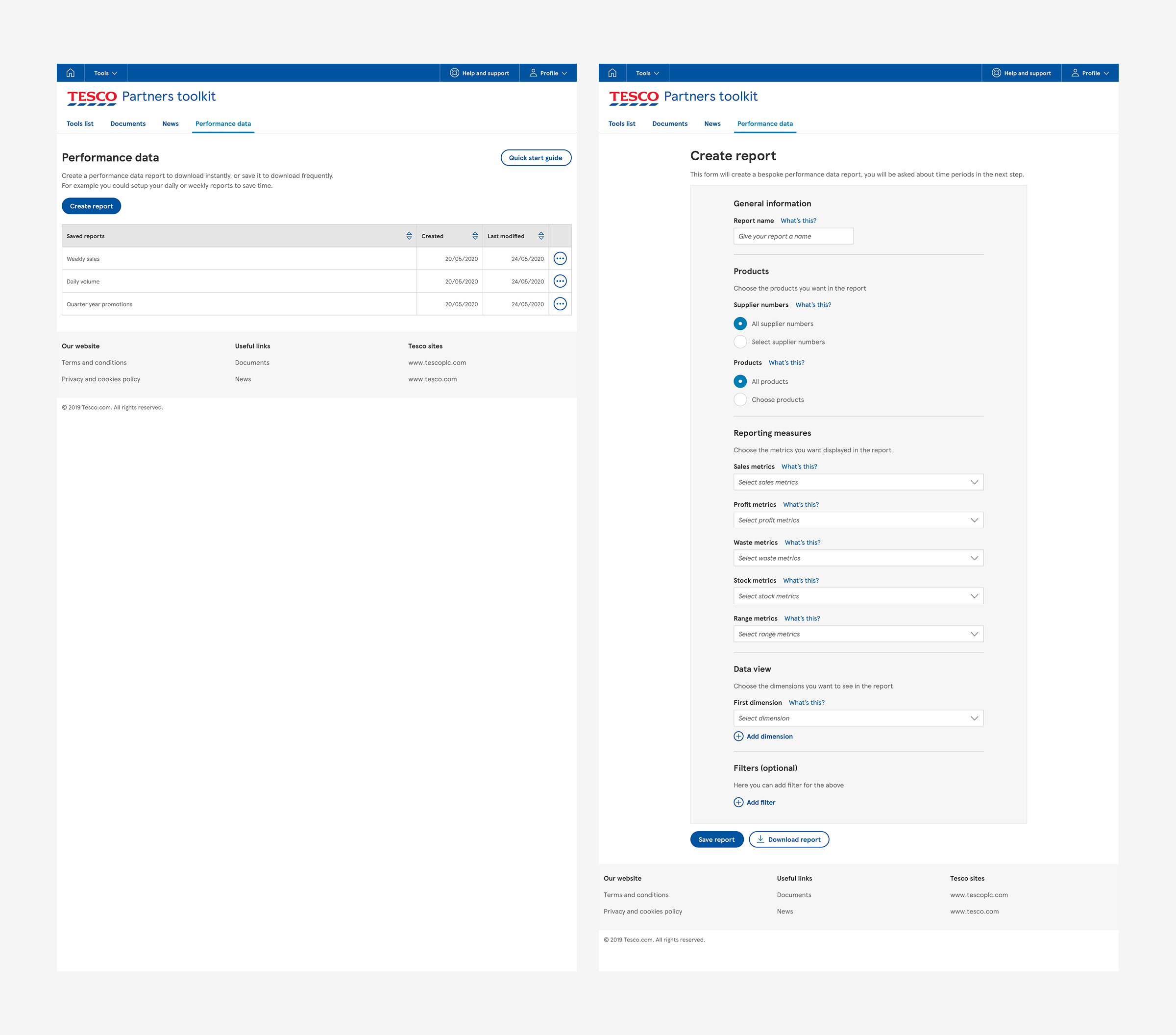
The research had shown us that all our suppliers had downloaded data, but not all were aware of how to manipulate the downloads into more useful formats. As a quick win and to get a new product released, we decided to focus on data downloads initially and then on data visualisation at a later date, with a view to bringing them together at some point.
I created a test group of friendly suppliers who were invested in the new platform and always made themselves available at short notice. We would meet ad hoc to review concepts and test prototypes, gathering feedback that we could iterate on to fine-tune the designs quickly.
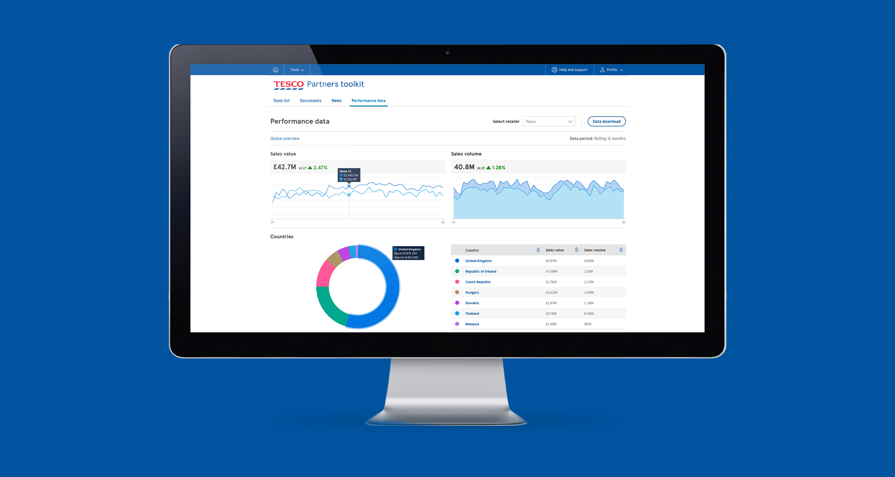
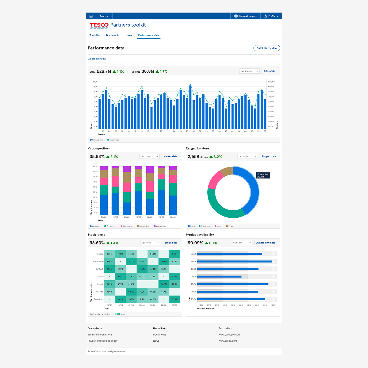
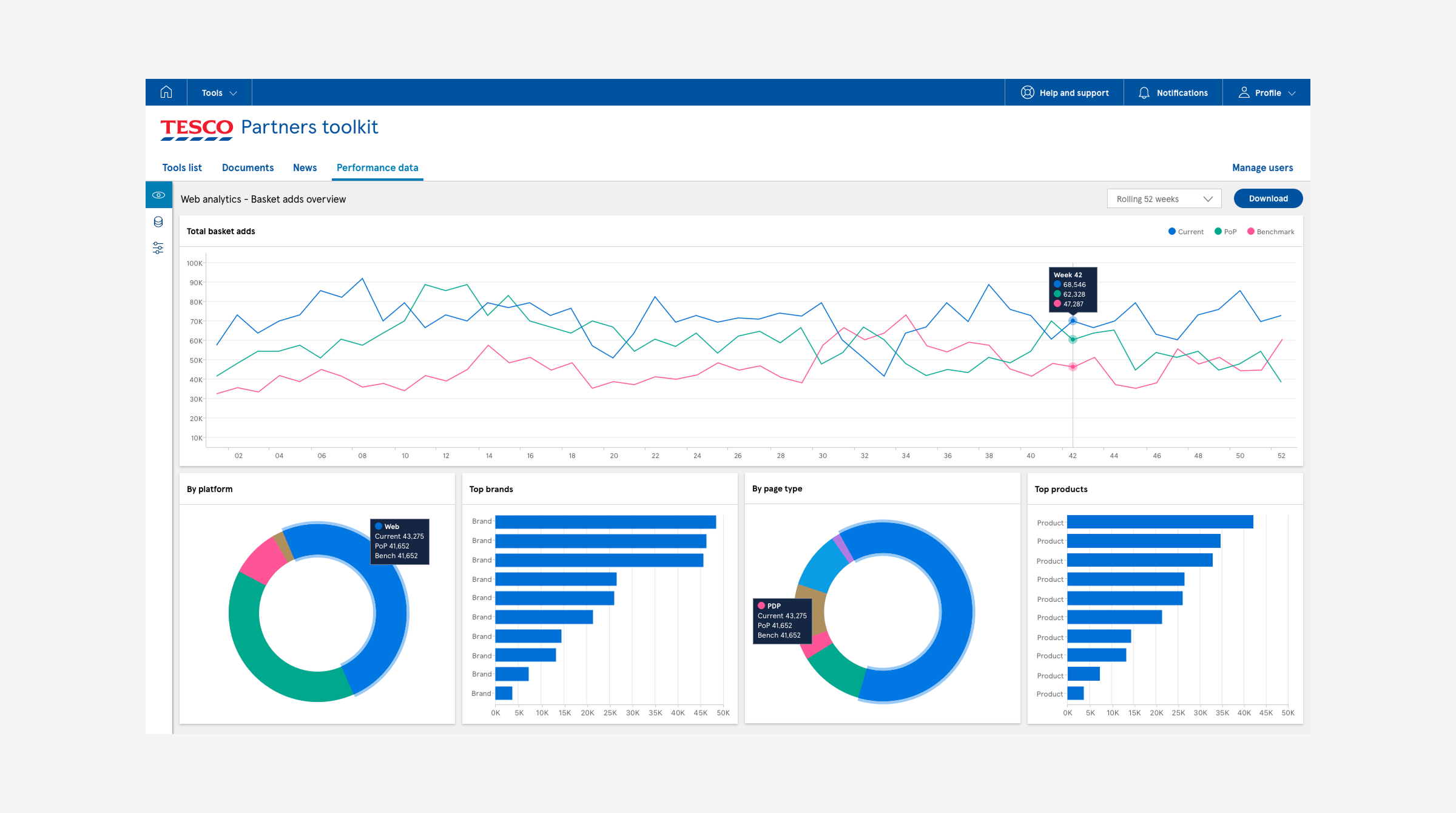
To help suppliers get more from their data and begin the journey toward providing more insight, answers, and recommendations, we built the first release of our dashboard. These contained the most common data charts and visualisations we saw suppliers use when analysing their tasks and workflows. They were particularly helpful for our small to medium-sized suppliers, as they saved time on recreating the charts and visualisations in software such as Excel or Google Charts. The larger suppliers generally used Power BI, Tableau or bespoke visualisation software.
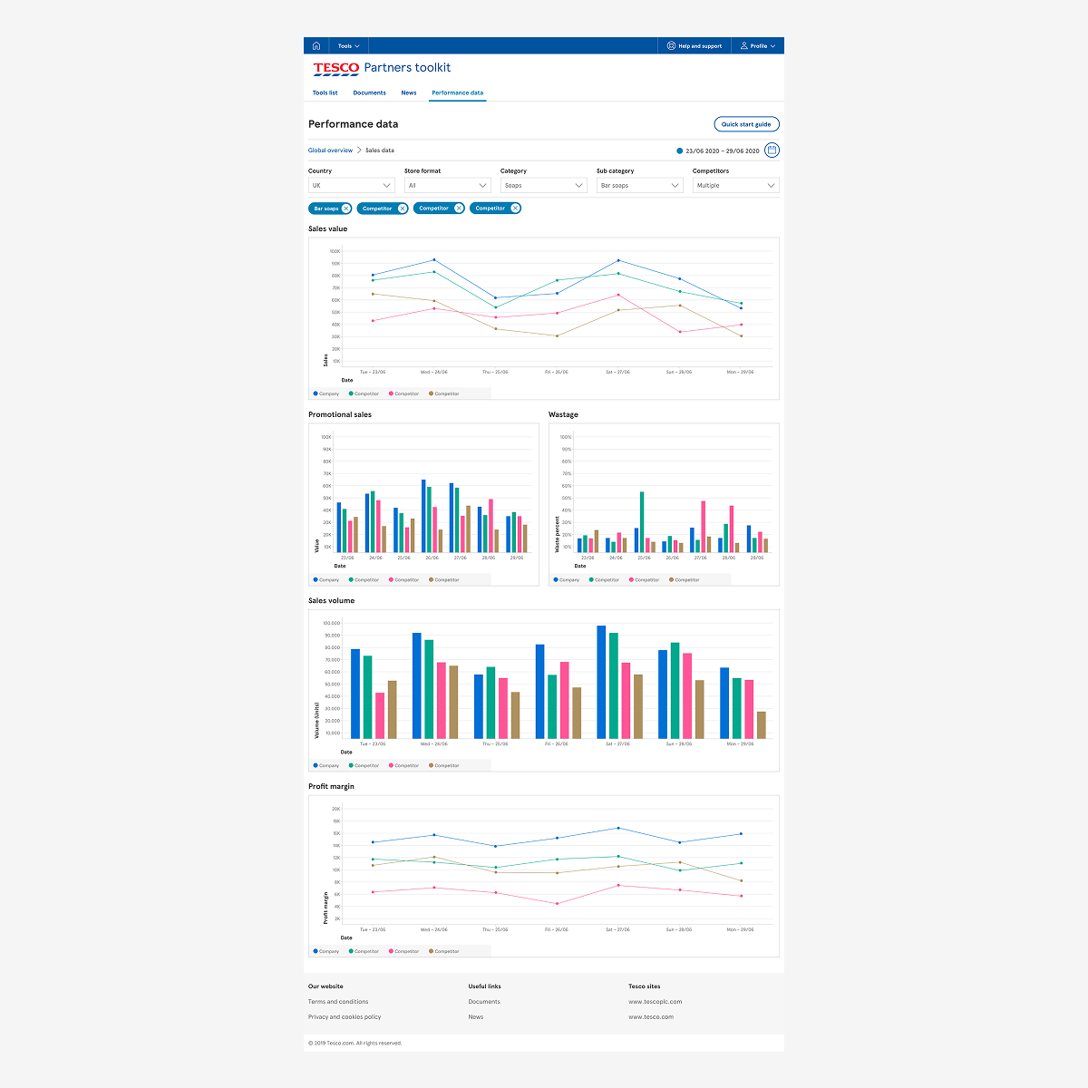
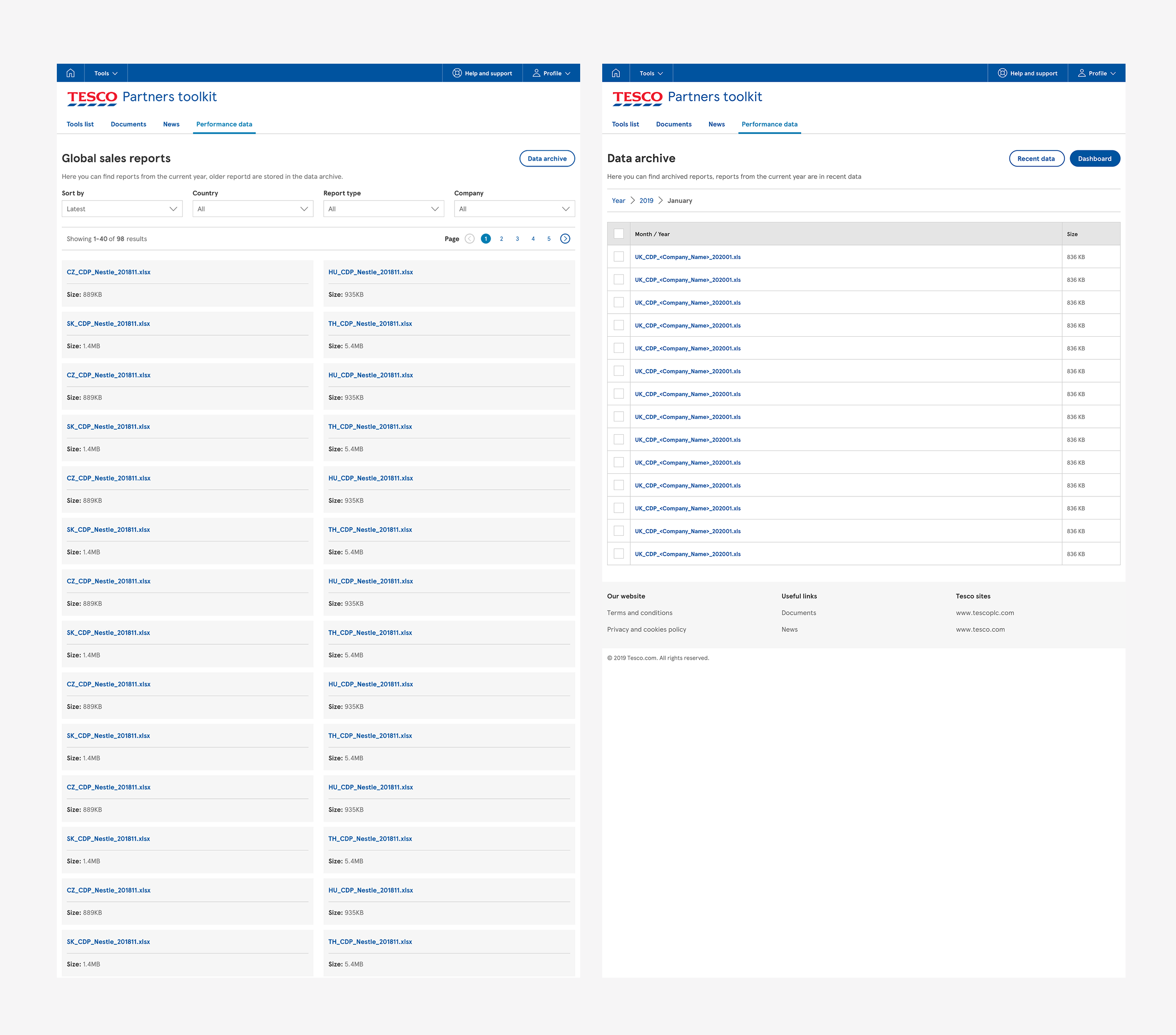
We were replacing a system and interface that was well over 10 years old, so it wasn’t hard to win over the suppliers with the new offering. We designed a simple, intuitive interface that had ‘pre-canned’ report options and also the ability to tailor the metrics and structure of the download so suppliers could save time reformatting Excel files into the structures they needed for their ongoing analysis.